Discover elegant & affordable furniture for every room
Transform your furniture with sophisticated and stylish pieces, and create a serene and inviting home.


Top Rated
Explore our collection of top-rated furniture, handpicked for quality and style to elevate your living spaces.

Elegant Oak Table Lamp
A beautifully crafted oak table lamp that combines elegance and functionality. This lamp is perfect for adding a touch of sophistication to any space, whether it's a living room, bedroom, or office. The warm glow of the lamp creates a cozy atmosphere, while its classic design complements a variety of interior styles.

Elegant Oak Mirror
An elegant wall-mounted mirror that adds a touch of sophistication to any space. The mirror features a beautifully crafted oak frame that complements various decor styles, enhancing the ambiance of your room.

Stylish Oak Wardrobe
A stylish oak wardrobe that offers ample storage space with a modern design. Perfect for organizing your clothes and accessories, it features beautifully crafted doors and a sturdy build.

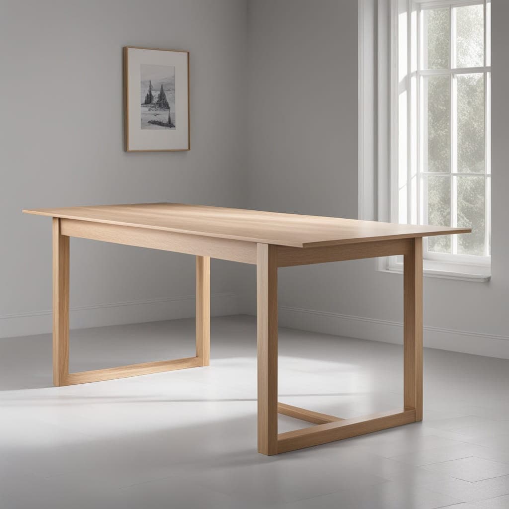
Random Wooden Chair
A comfortable and stylish chair made from high-quality walnut wood. This chair features a classic design that complements any home decor. It is perfect for dining rooms, living rooms, or even as an accent piece. The sturdy construction ensures durability and longevity, making it a great investment for your home.

Chair
A comfortable and stylish chair, perfect for any living space. It features a padded seat and backrest, ensuring maximum comfort for prolonged sitting sessions.

Modern Sofa
A stylish and comfortable modern sofa, perfect for any living room. Upholstered in a luxurious fabric, it features a sleek design and sturdy frame for durability. Ideal for both small and large spaces, this sofa adds a touch of elegance to your home decor.

Random Stool
A stylish and comfortable stool, perfect for any setting. Made from high-quality wood, this stool provides both comfort and durability. It features a sleek design that complements modern and traditional interiors alike.

Horizon Stool
The Horizon Stool is a perfect blend of comfort and style, featuring a padded seat and sturdy legs. Ideal for kitchens and bar areas, adding a touch of elegance.
Most Popular
Explore our collection of most-popular furniture, handpicked for quality and style to elevate your living spaces.

Modern Oak Desk Lamp
A sleek and contemporary desk lamp that combines functionality with aesthetic appeal, crafted from high-quality oak wood. Perfect for any modern workspace, it features an adjustable arm for customizable lighting angles and a warm, inviting glow.

Mid-century Modern Table Lamp
This elegant lamp features a mid-century modern design, combining stylish aesthetics with functionality. Its soft light is perfect for creating a cozy atmosphere in any room, making it a great addition to your decor.

Modern Floor Lamp
A sleek and stylish modern floor lamp that fits perfectly in any contemporary setting. It features a minimalist design, providing both functionality and elegance to your living space. The soft, warm light creates a cozy atmosphere, making it ideal for reading or relaxing.

Eco-Friendly Lamp
This eco-friendly lamp combines sustainability with modern design, perfect for any room.
Our Blog
Stay updated with our latest articles, tips, and trends in furniture and home decor.

Mastering Responsive Design
Techniques and best practices to build websites that look great on every screen size. From media queries to modern CSS, this guide walks through how to design with flexibility, speed, and user experience in mind.
A complete guide for web developers aiming to build responsive, mobile-friendly websites. Understand the principles of flexible design, breakpoints, mobile-first workflows, and key tools for testing responsiveness. Learn how to go beyond media queries and build layouts that adapt smoothly across devices.
This post walks you through best practices, modern CSS techniques like `clamp()` and `container queries`, and common mistakes to avoid. By the end, you'll have a repeatable process for making every project look great—no matter the screen size.
#### 1. Start Mobile-First
Design for the smallest screen first. It forces you to prioritize:
- Core layout
- Key content
- Performance
Once that works, scale up with media queries.
```css
/* Base styles: Mobile first */
body {
font-size: 16px;
}
/* Scale up for larger screens */
@media (min-width: 768px) {
body {
font-size: 18px;
}
}
```
<Quote name="Ethan Marcotte">
"Responsive design is not a trend — it's a fundamental shift in how we build for the web."
</Quote>
#### 2. Use Relative Units
Avoid hardcoded pixels.
Use:
- `rem` for typography
- `%`, `vw`, `vh` for layout
- `clamp()` for fluid sizing
```css
h1 {
font-size: clamp(1.5rem, 2vw + 1rem, 3rem);
}
```
#### 3. Breakpoints That Make Sense
Don’t follow arbitrary device widths.
Instead, add breakpoints when your layout **breaks**.
Common breakpoints (as a reference):
- 480px – small phones
- 768px – tablets
- 1024px – small laptops
- 1280px – desktops
But again: base it on your design, not someone else’s template.
#### 4. Modern Layout Tools
Make use of:
- Flexbox for 1D layout
- CSS Grid for 2D layout
- `minmax()`, `auto-fit`, and `auto-fill` for flexible grids
```css
.grid {
display: grid;
grid-template-columns: repeat(auto-fit, minmax(250px, 1fr));
gap: 1rem;
}
```
#### 5. Test on Real Devices
Use browser dev tools, but don’t stop there.
Also test:
- Your own phone
- A tablet if possible
- Screen readers (if accessibility matters)
Tools like:
- [Responsively App](https://responsively.app/)
- [BrowserStack](https://www.browserstack.com/)
- Chrome's device toolbar
<BlogImg src="https://images.unsplash.com/photo-1615800001997-cb9f68304c35?auto=format&fit=crop&w=1740&q=80" alt="Responsive design in action"/>
#### 6. Performance Still Wins
A site that’s responsive but slow = still a bad experience.
Optimize:
- Images (use `srcset`)
- Fonts (subset, preload)
- CSS (avoid bloated frameworks)
Use [Lighthouse](https://developers.google.com/web/tools/lighthouse/) to audit.
#### 7. Go Beyond Media Queries
New CSS specs let you target layout context directly:
- **Container Queries** (CSS now supports them)
- **Aspect-ratio**
- **`:has()`** pseudo selector for parent-state logic
```css
@container (min-width: 600px) {
.card {
flex-direction: row;
}
}
```
This is the future of responsive design: based on context, not just screen width.
#### 8. Final Thoughts
Responsive design is a skill.
It’s not about memorizing breakpoints—it’s about thinking fluidly.
Start small.
Test often.
And always design with the end user in mind.
Your sites will look and feel better across the board.

AI Chatbots for Ecommerce
How AI chatbots are transforming customer service, increasing conversions, and saving hours of support time for ecommerce businesses.
AI chatbots have moved beyond gimmicks—they're now business-critical tools.
In ecommerce, fast, 24/7 support can be the difference between a sale and an abandoned cart.
This guide breaks down how AI chatbots work, where to deploy them, and how to train them to feel like an extension of your team.
#### 1. Why AI Chatbots Work
They respond instantly, handle repeat questions, and never get tired.
Perfect for:
- Order tracking
- FAQs
- Product suggestions
- Upselling and cross-selling
<Quote name="Fezey Studio">
"Think of a chatbot as your store’s best rep—on duty 24/7."
</Quote>
#### 2. Where to Use Them
- Website (popup chat, floating button)
- Instagram DMs
- Facebook Messenger
- WhatsApp Business
Each platform reaches your customer where they already spend time.
#### 3. Training Your Bot
Use your own content:
- Past support chats
- Product descriptions
- Brand voice
Our bots at Fezey are custom-trained on this, so they sound natural—not robotic.
#### 4. Making Sales (Not Just Support)
Well-trained bots = better conversions.
Use them to:
- Answer objections in real-time
- Recommend bundles
- Capture emails or phone numbers for abandoned carts
```json
{
"intent": "order_help",
"response": "Sure! Can you share your order ID so I can check the status?"
}
```
#### 5. Metrics That Matter
Track:
- Response rate
- Conversion lift
- Time saved per agent
Tools like Manychat, Intercom, or custom GPT bots give detailed analytics.
<BlogImg src="https://images.unsplash.com/photo-1629904853716-f0bc54eea481?auto=format&fit=crop&w=1740&q=80" alt="Ecommerce chatbot interface"/>
#### 6. Costs & ROI
Some tools are free.
But custom-trained bots (like ours) cost ~$399/mo.
Worth it if you’re doing $10k+ in monthly sales.
Why?
- More sales
- Fewer support tickets
- Happier customers
#### 7. Wrap-Up
AI chatbots are no longer optional.
They’re part of the modern ecommerce stack.
Start small. Automate one flow.
Then scale it.

The Power of Visual Hierarchy in Web Design
Good design isn’t just about colors and fonts. It’s about directing attention. Learn how to use visual hierarchy to guide users and improve UX.
Design tells a story—even before a user clicks.
#### 1. What is Visual Hierarchy?
It’s the order in which users process content.
Use:
- Size
- Color
- Contrast
- Spacing
to guide them.
<Quote name="Steve Krug">
"Don't make me think."
</Quote>
#### 2. Headline First, Always
Your H1 should be the loudest voice.
Don’t let it compete with other elements.
#### 3. Make CTAs Pop
Buttons should be:
- High contrast
- Consistent
- Positioned logically
```css
.cta {
background: #111;
color: white;
padding: 1rem 2rem;
border-radius: 6px;
}
```
#### 4. Spacing is a Superpower
White space = breathing room.
It creates separation and focus.
#### 5. One Focus Per Section
Don’t crowd multiple ideas into one screen.
<BlogImg src="https://images.unsplash.com/photo-1581276879432-15a76b1f027c?auto=format&fit=crop&w=1740&q=80" alt="Website layout with clear visual hierarchy"/>
#### 6. Typography Rules
Hierarchy isn’t just size.
Use:
- Weight (bold/regular)
- Case (uppercase for impact)
- Style (italic/subtle)
#### 7. Consistency Wins
Make the rules and follow them.
That’s how your site feels polished.

Boosting Web Performance with Lazy Loading
Speed is currency on the web. Learn how to implement lazy loading to improve page load times and user satisfaction.
Lazy loading = load content only when needed.
Saves bandwidth. Speeds up page.
#### 1. Why It Matters
Faster sites:
- Rank higher
- Convert better
- Get more engagement
#### 2. How It Works
Instead of loading all images/scripts at once...
You load them **on scroll** or **on interaction**.
#### 3. Native Lazy Loading
It’s built into HTML now:
```html
<img src="product.jpg" loading="lazy" alt="Product"/>
```
#### 4. Lazy Load Video & Iframes
Same logic applies:
```html
<iframe src="video.mp4" loading="lazy"></iframe>
```
#### 5. JS-Based Solutions
For more control:
- Lozad.js
- LazyLoad.js
<BlogImg src="https://images.unsplash.com/photo-1509395176047-4a66953fd231?auto=format&fit=crop&w=1740&q=80" alt="Performance optimization graph"/>
#### 6. Watch for SEO Impact
Use fallback content or noscript tags:
```html
<noscript>
<img src="product.jpg" alt="Product"/>
</noscript>
```
#### 7. Test Results
Use Lighthouse or WebPageTest to compare performance before/after.
Newsletter
Subscribe to our newsletter to receive the latest updates, offers, and trends directly in your inbox.